BRAND REVITALISATION //
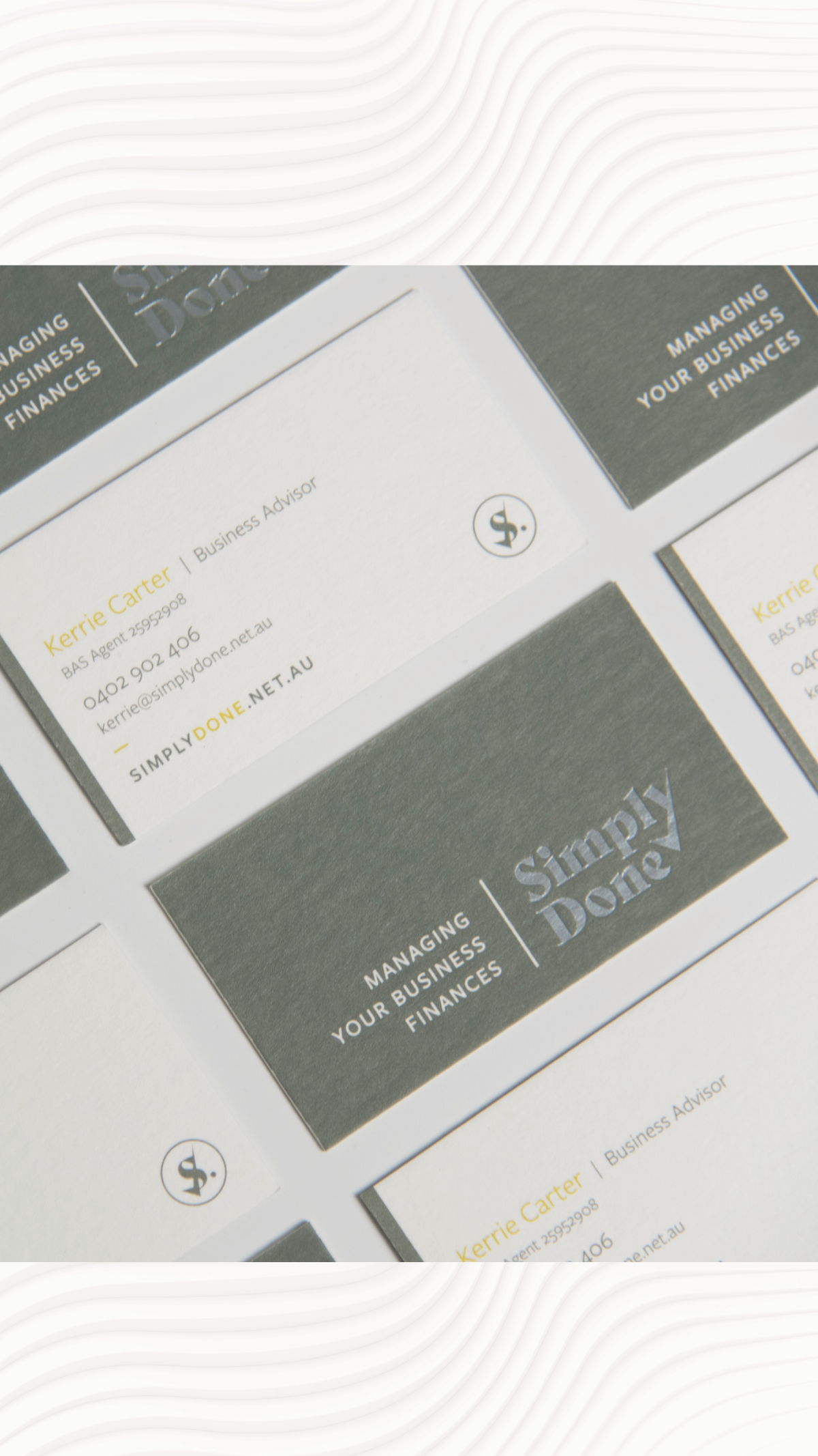
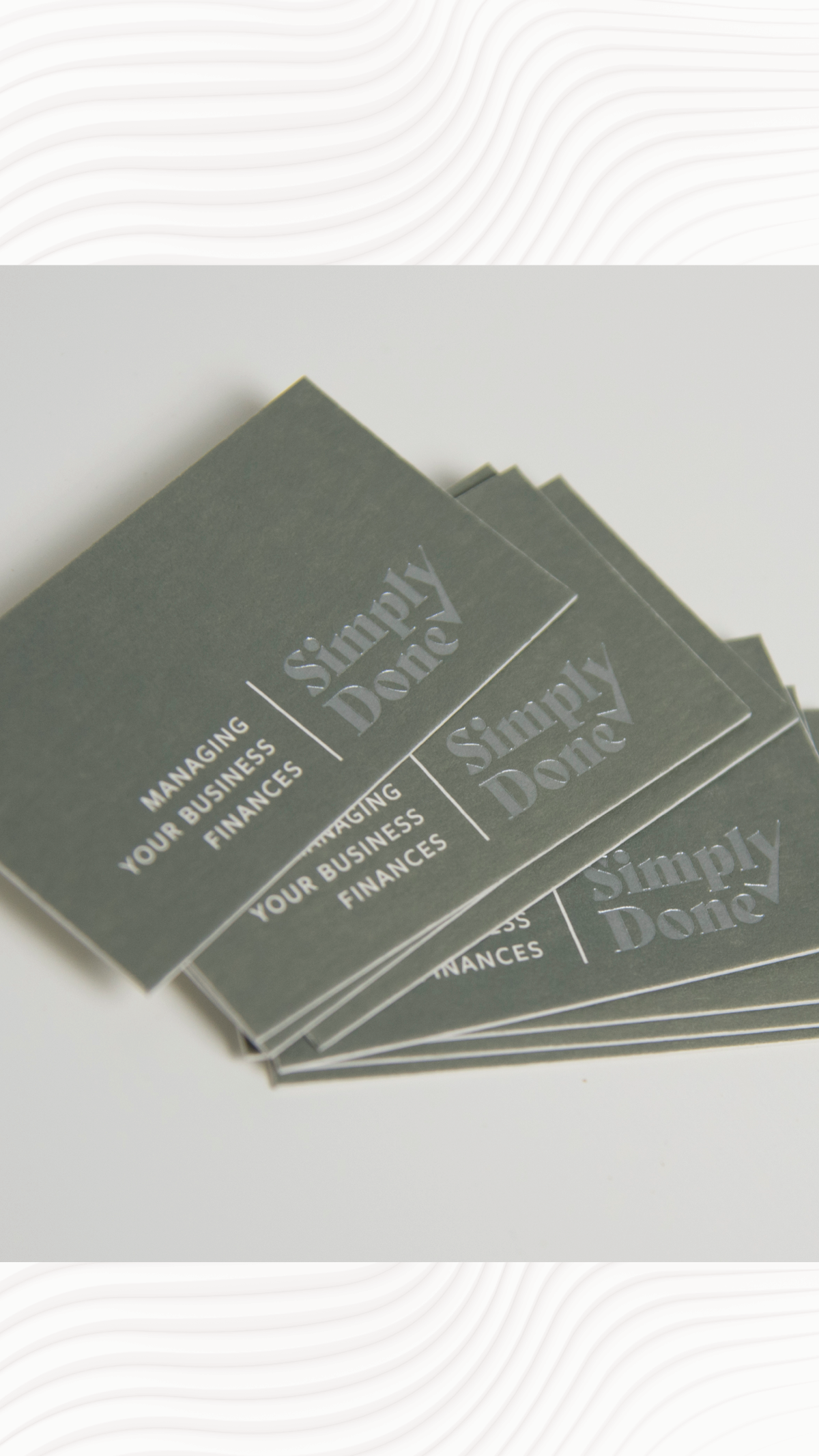
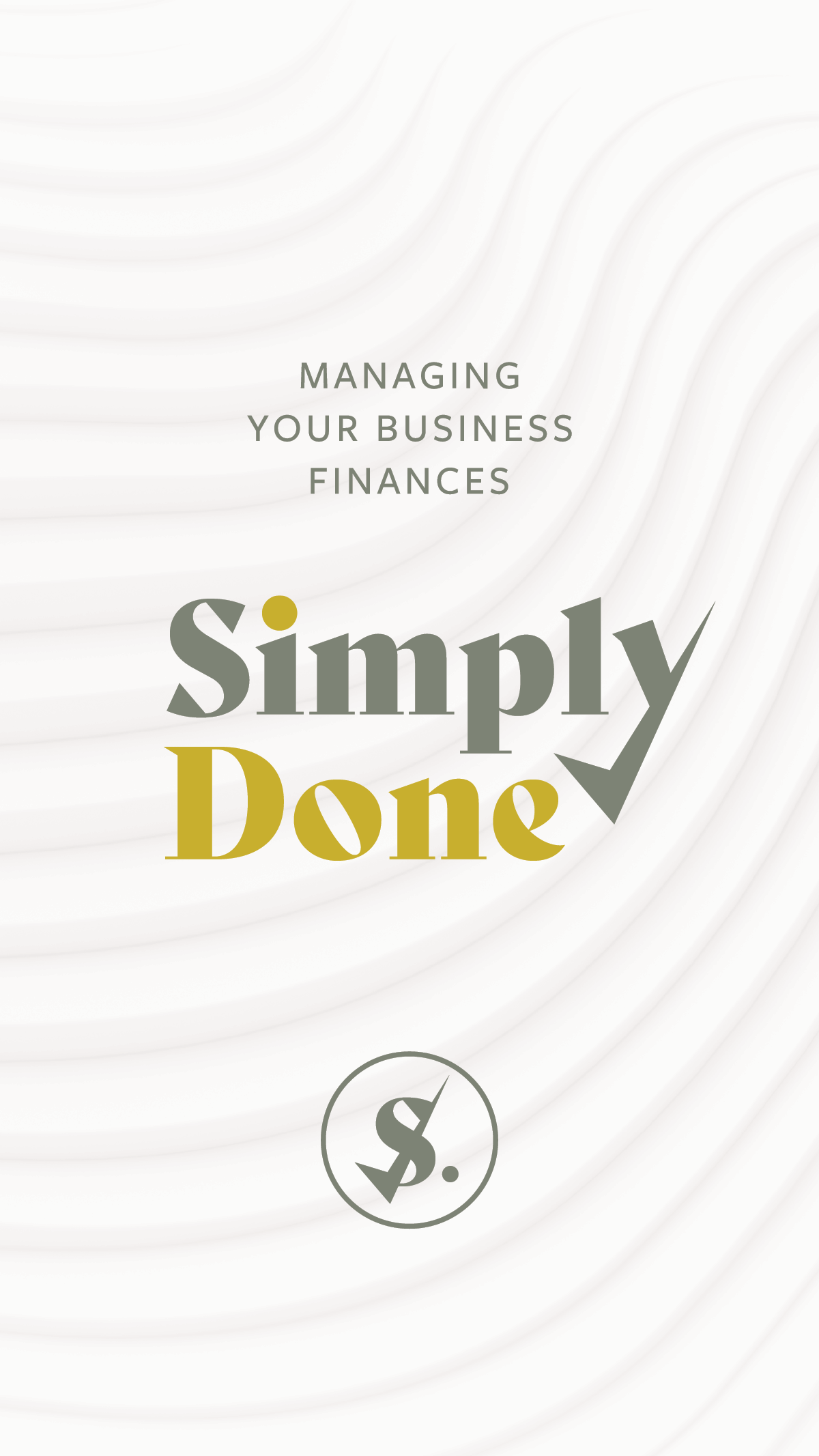
Simply Done is a business that manages the finances and meets all ATO obligations for small to medium enterprises Australian wide, with a mission to bring peace of mind to clients knowing that their financial position and bookkeeping are in capable hands so they can focus on the success and growth of their own business.
Simply Done prides themselves in filling the role that releases you from the burden of bookkeeping, endless paperwork and stress. With an outdated website and logo that needed updating Kerrie approached me to revitalise her existing brand that conveyed a welcoming, professional and sleek brand identity.
We created a sophisticated and professional design that was aligned with a fresh and light colour palette, with calming textures to communicate the welcoming, honest, professional and customer-focussed tone of voice.
To check out their new website please click here.
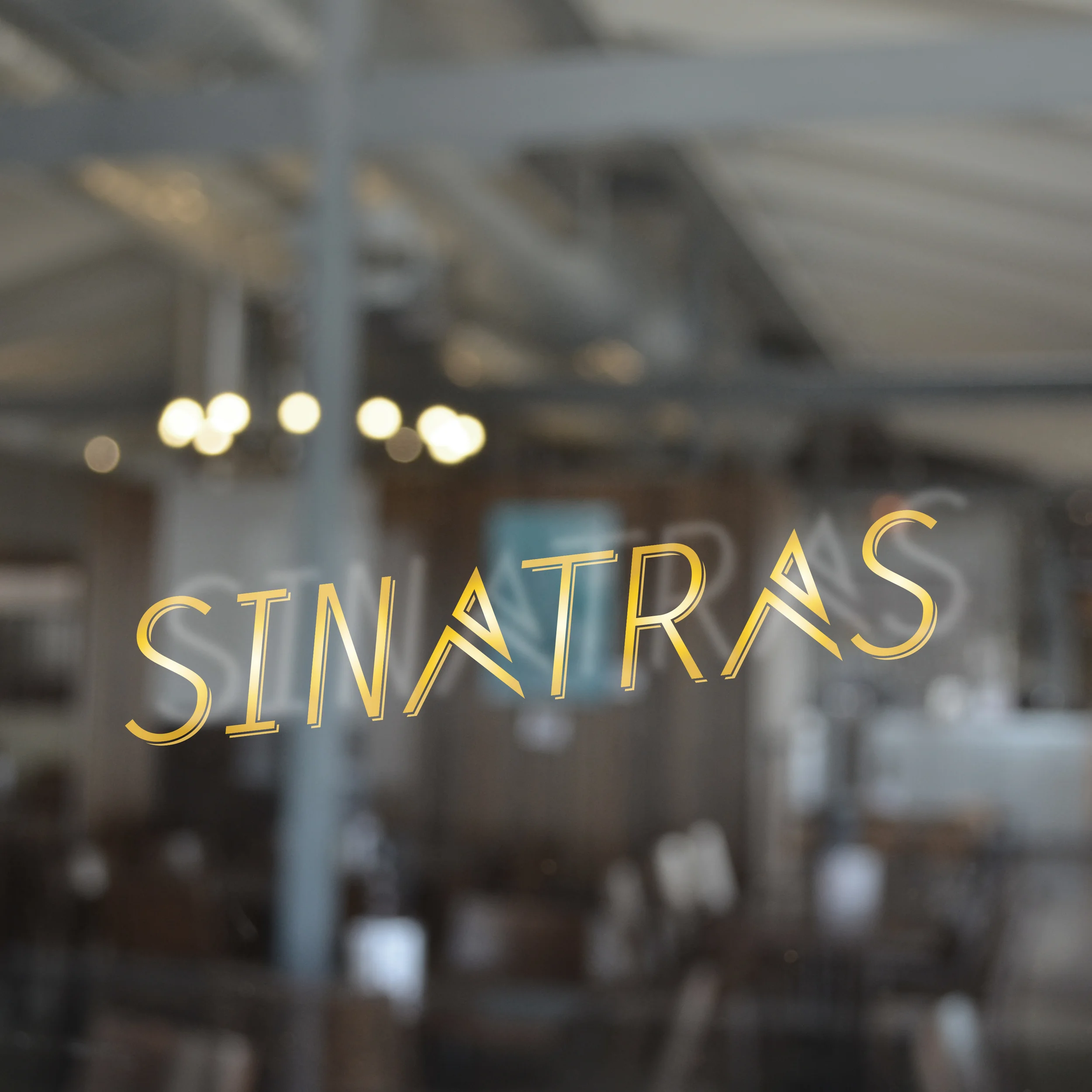
Overview:
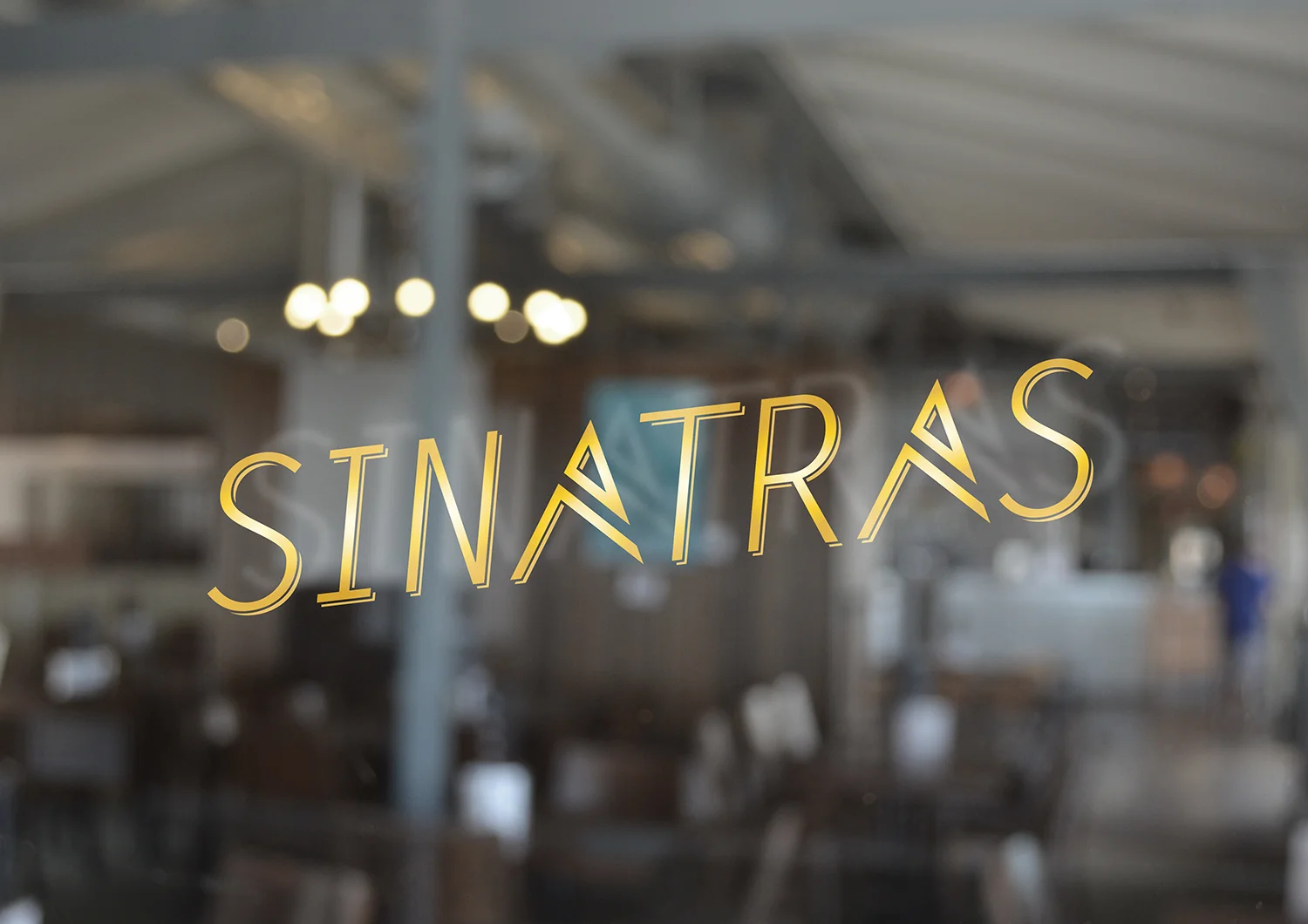
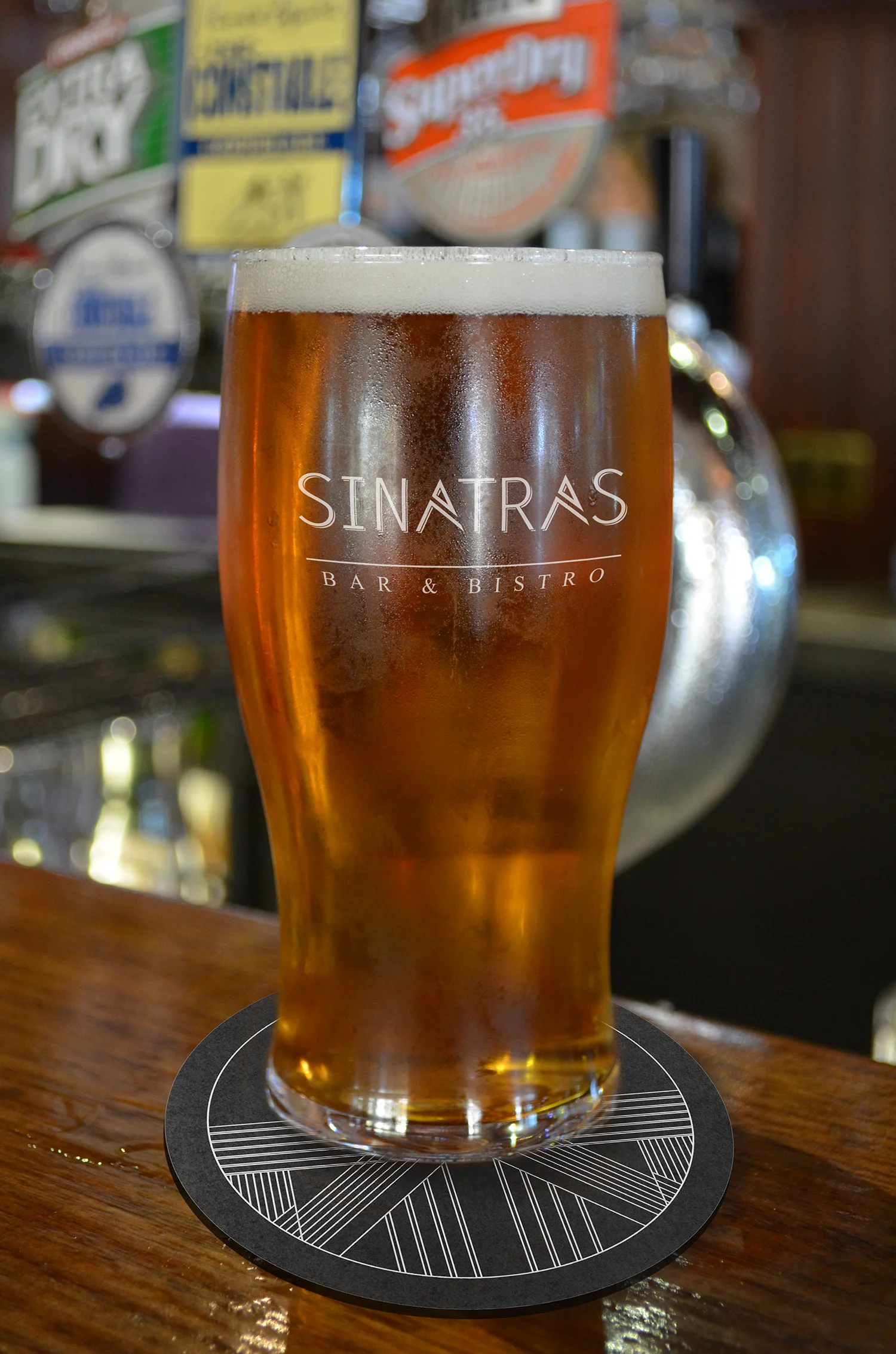
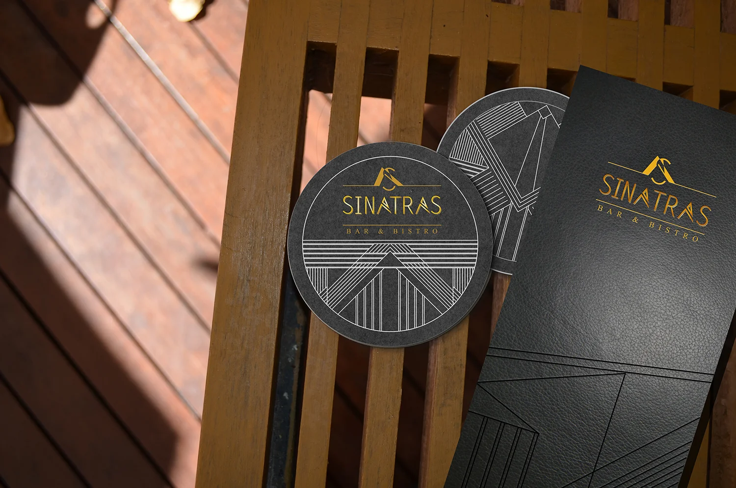
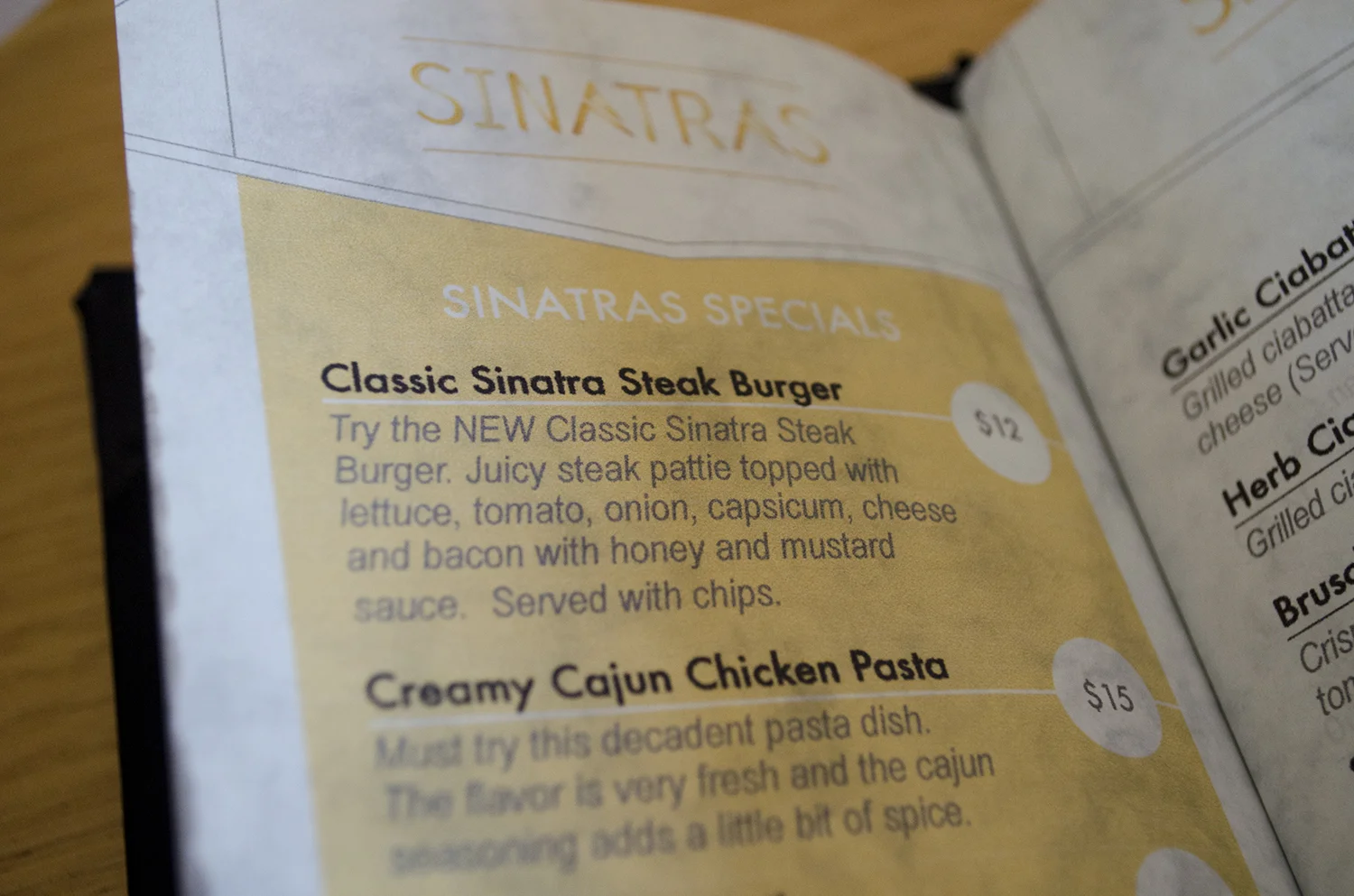
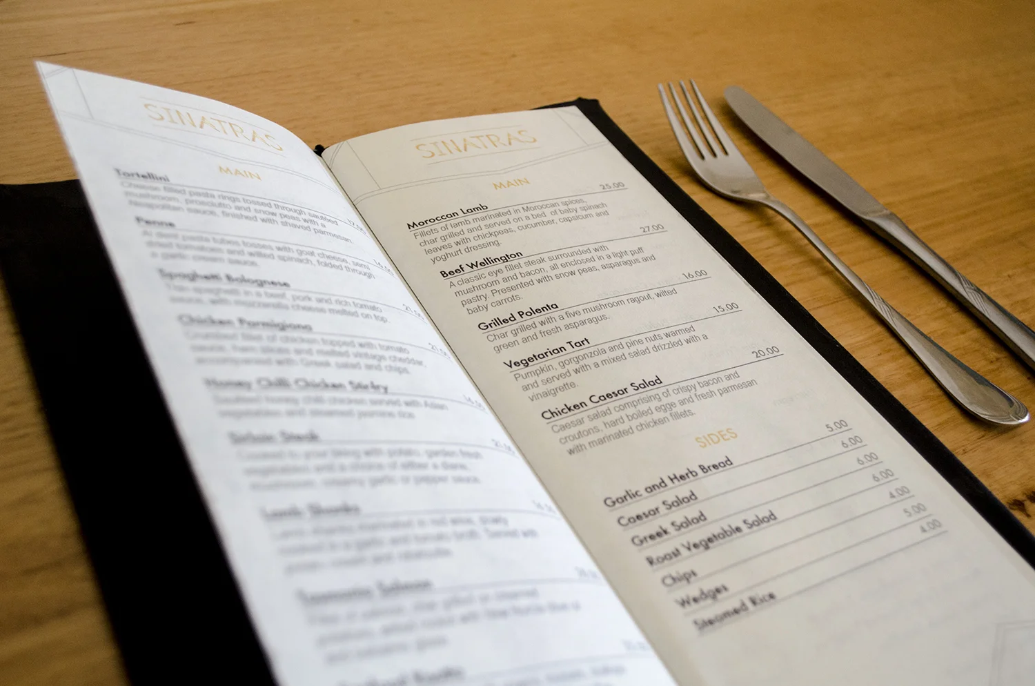
Sinatra’s is a boutique bar and bistro located away from the hustle and bustle, at the Northern end of King Street, Perth. Sinatras offers a warm, inviting and relaxed atmosphere with a variety of live music acts on offer ranging from blues and jazz to mellow acoustic.
Solution:
The brand identity for Sinatras makes reference to the Art Deco movement that was prominent in the 1920’s. Geometric patterning inspired by Art Deco and male suit attire has been created that is consistent across all applications, communicating a strong cohesive and elegant brand image that appeals to the exclusive mature audience.
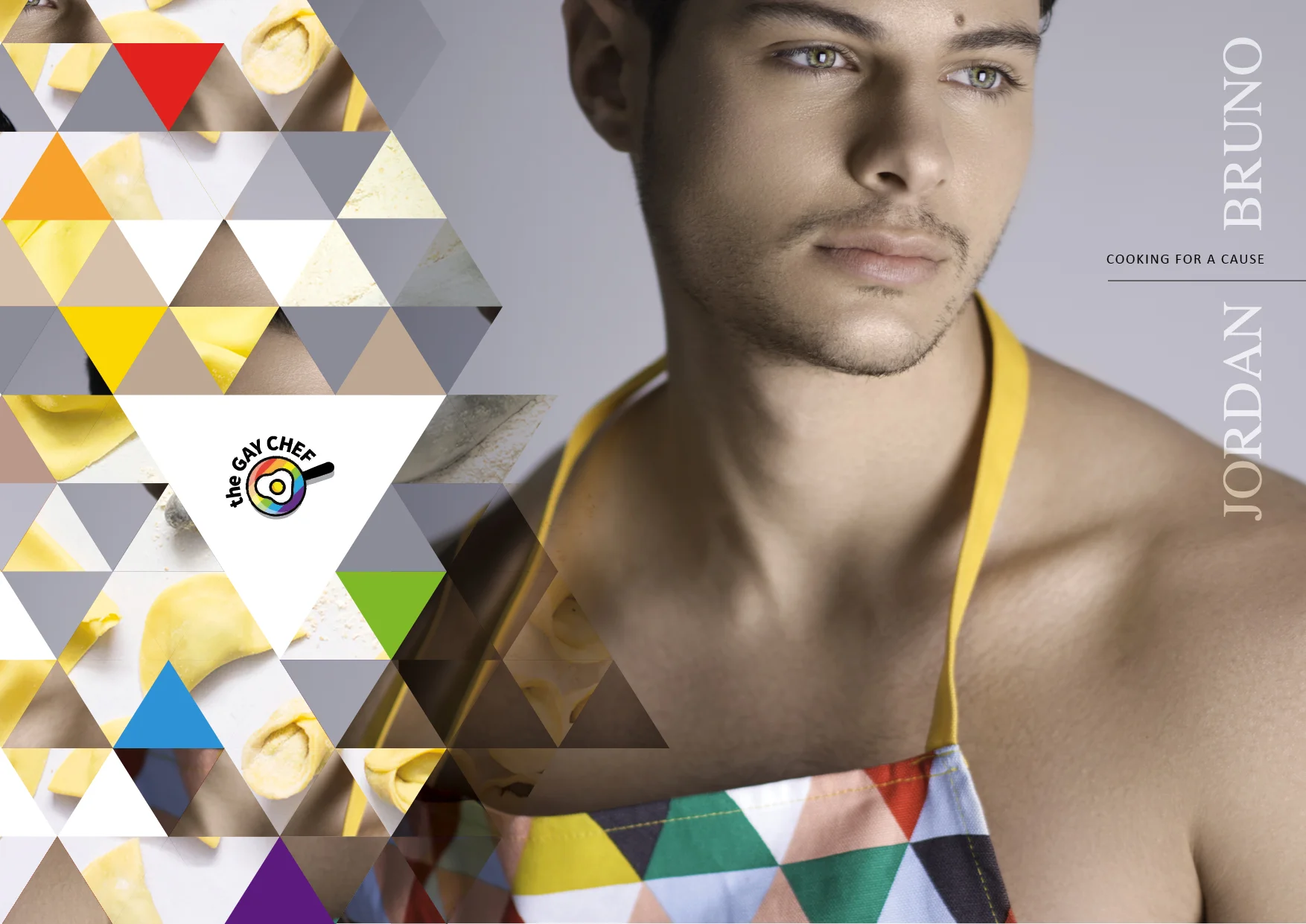
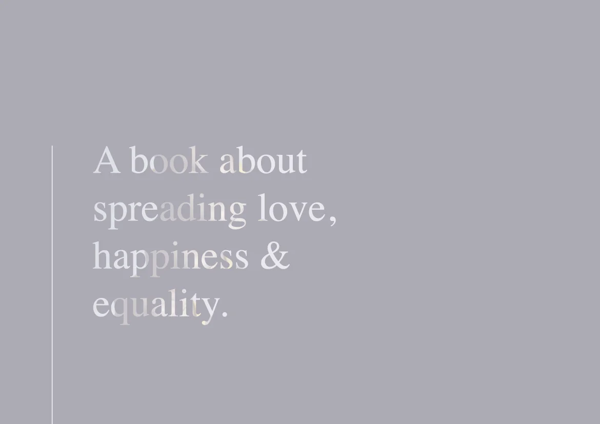
COOKING FOR A CAUSE // It was such a privilege to work alongside the incredible Jordan Bruno from MKR to design the layout for his first e-cookbook and collaborate with those who contributed to the book.
Not only is the book filled with 26 delicious recipes, 'The Gay Chef' aims to raise awareness about mental illnesses for youth in Australia, which shines through Jordan's experience and the broader community who have shared their experience, offering words of advice, love and support.
If you would like to see more, please click here and follow the prompts to receive your complimentary e-cookbook, with the option to donate to either Headspace or Minus18 charity, who are both doing amazing things in ensuring support for youth in Australia.
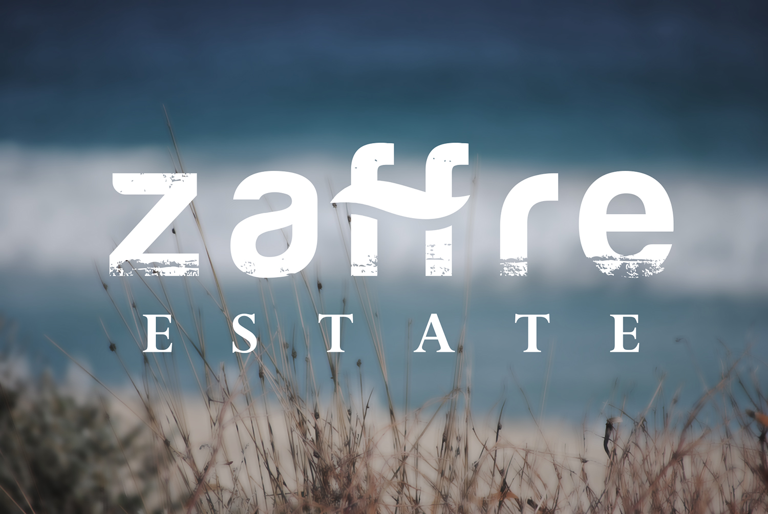
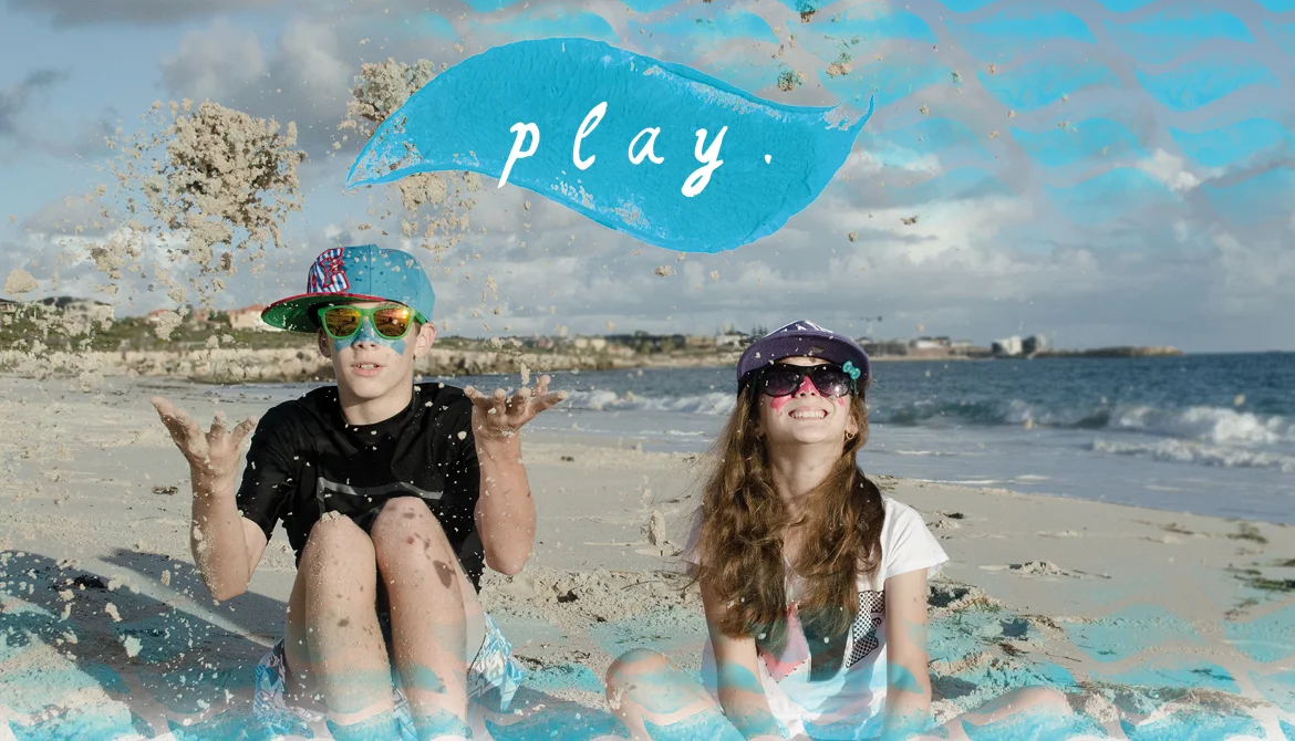
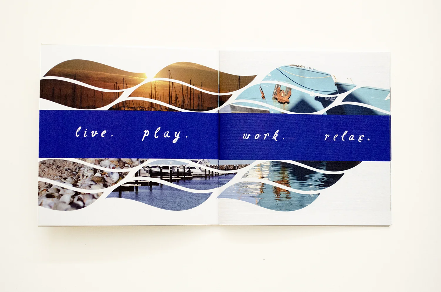
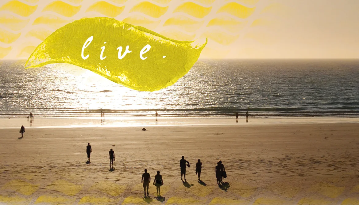
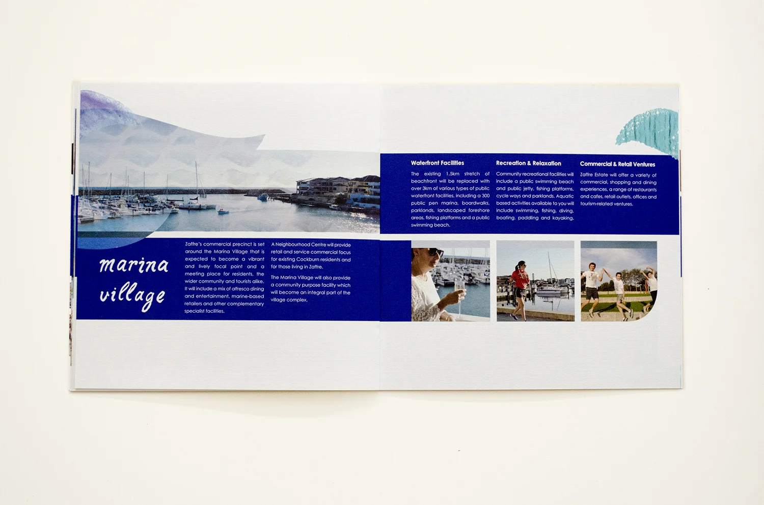
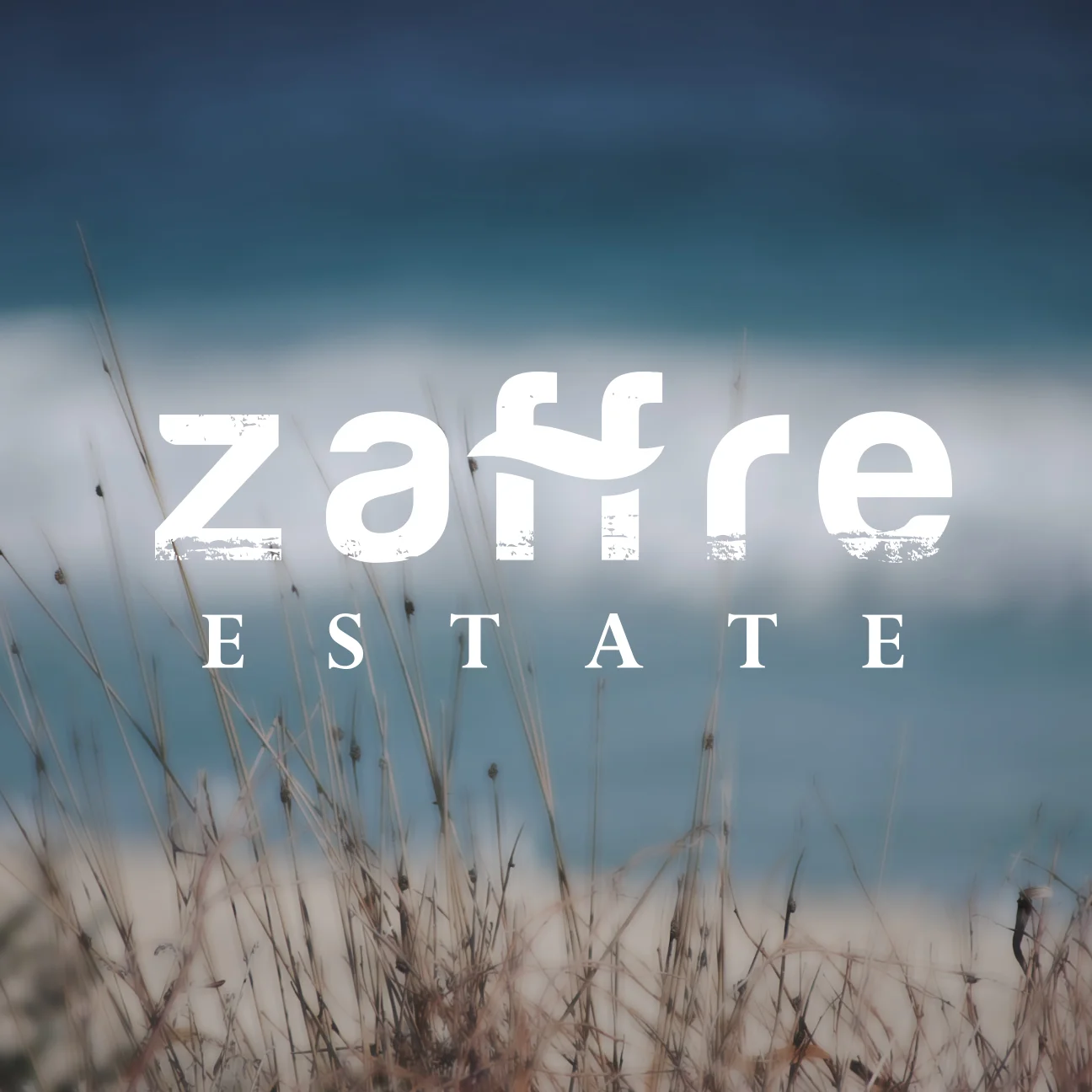
Overview:
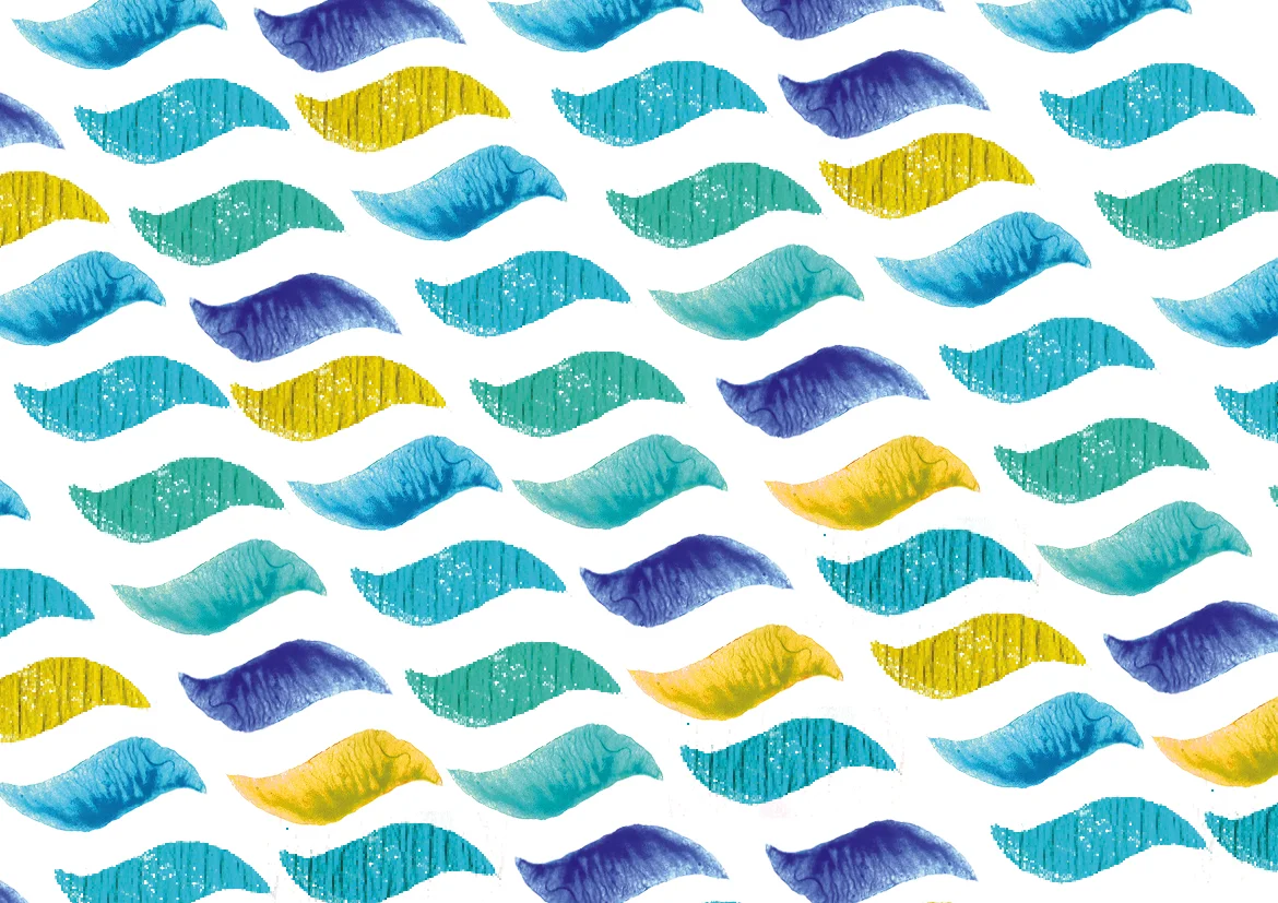
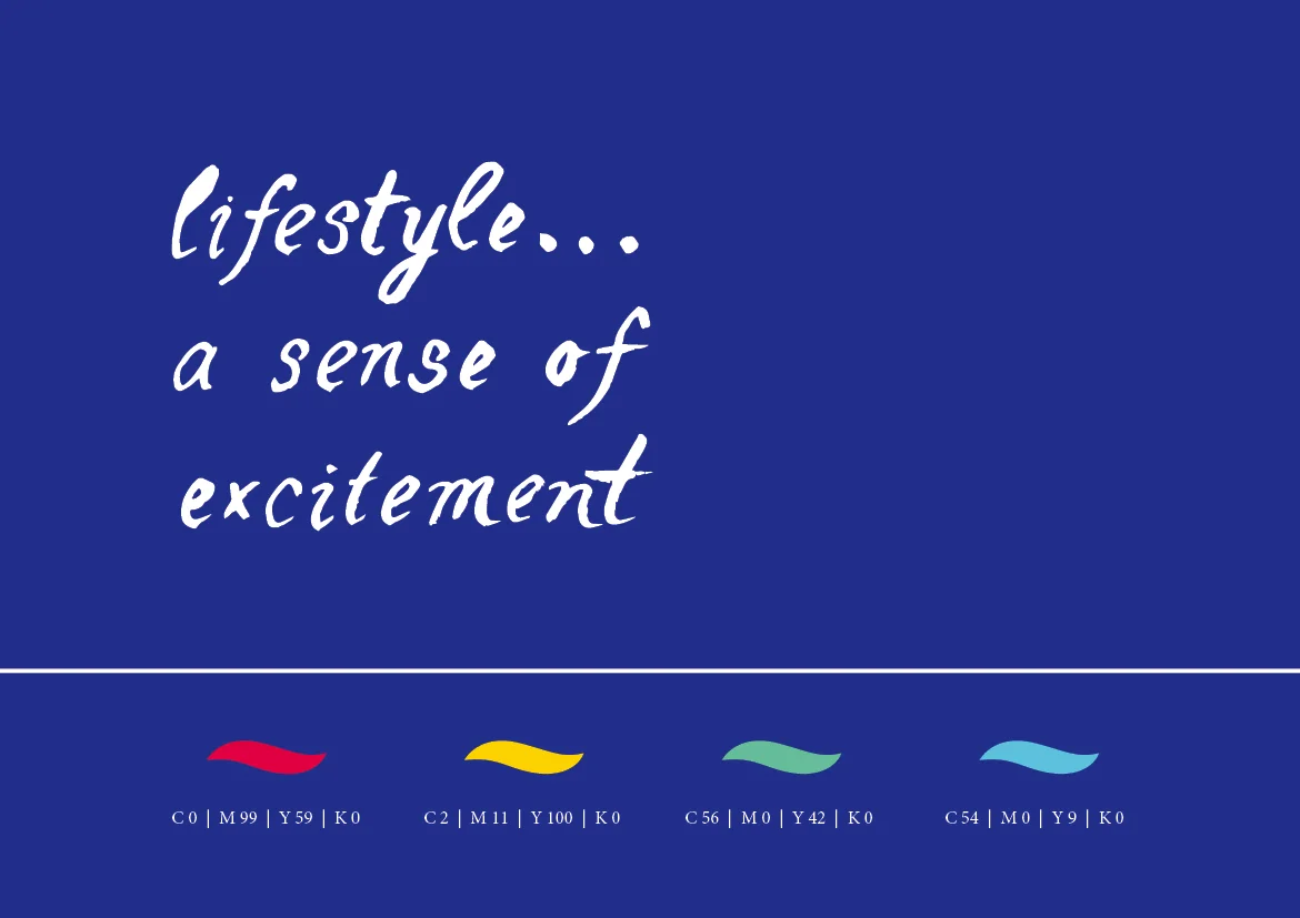
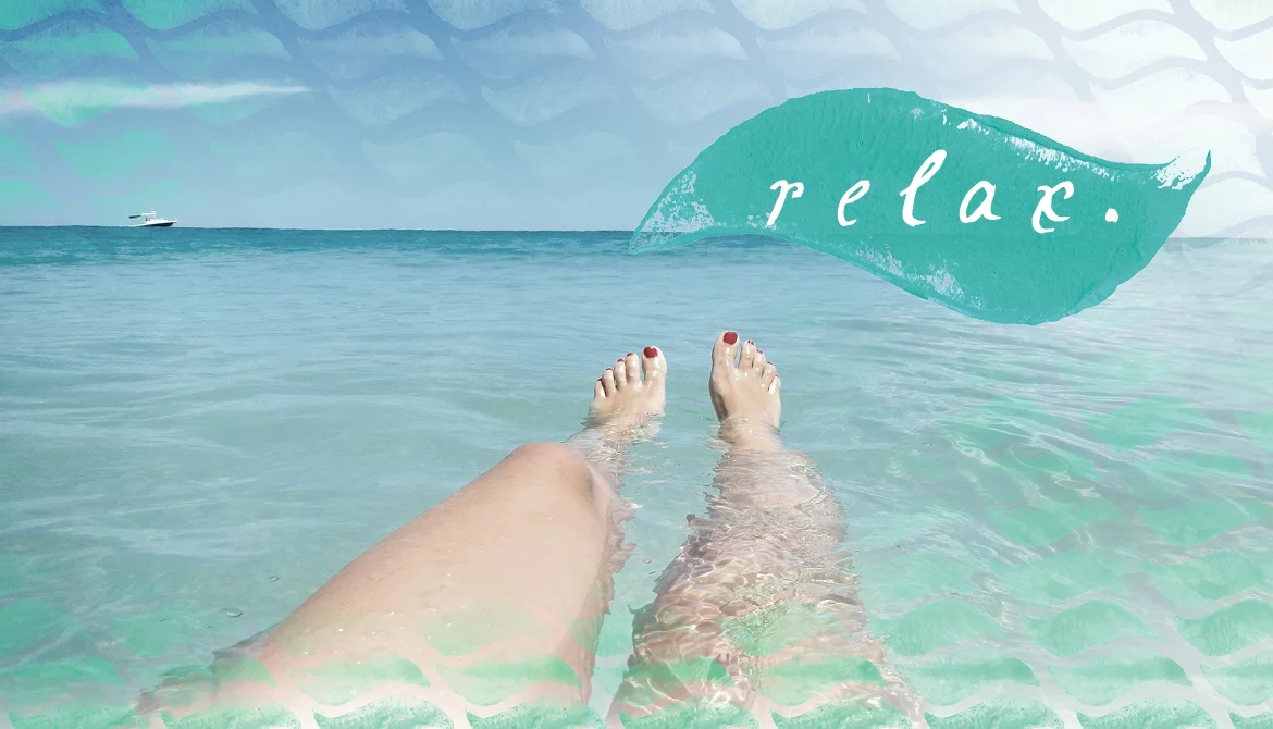
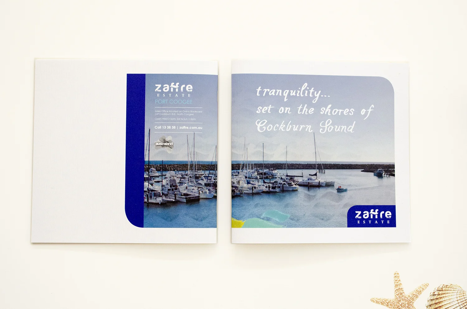
Zaffre Estate is a new hyperthetical coastal development set on the shores of Cockburn Sound providing a new world-class recreational marina and residential development. Zaffre is the area’s most innovative and exciting landmark, that is home to a thriving coastal community, offering a host of facilities and lifestyle options in a remarkable waterfront location.
Solution:
A watercolour brand strategy has been employed that is complimented with wave textures, hand crafted type and desaturated images, that are consistent across all applications, communicating a strong cohesive brand image. The brand strategy is successful as it communicates the laid back coastal lifestyle, that effectively appeals to the primary audience being young families.
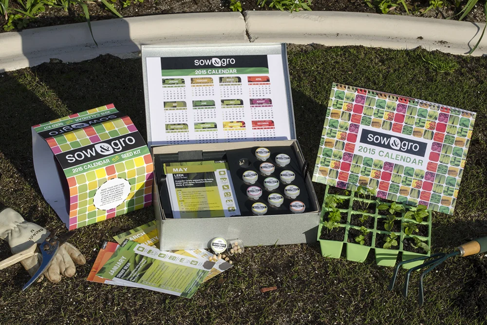
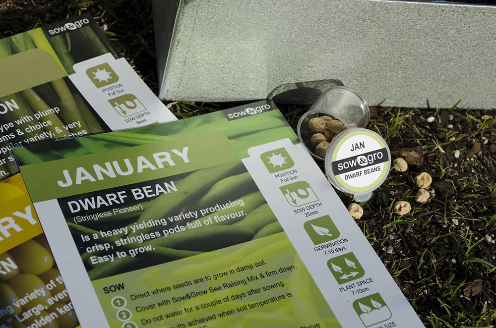
Solution:
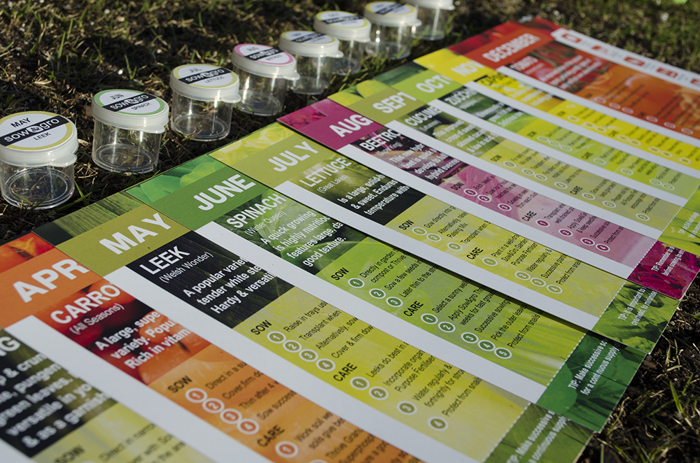
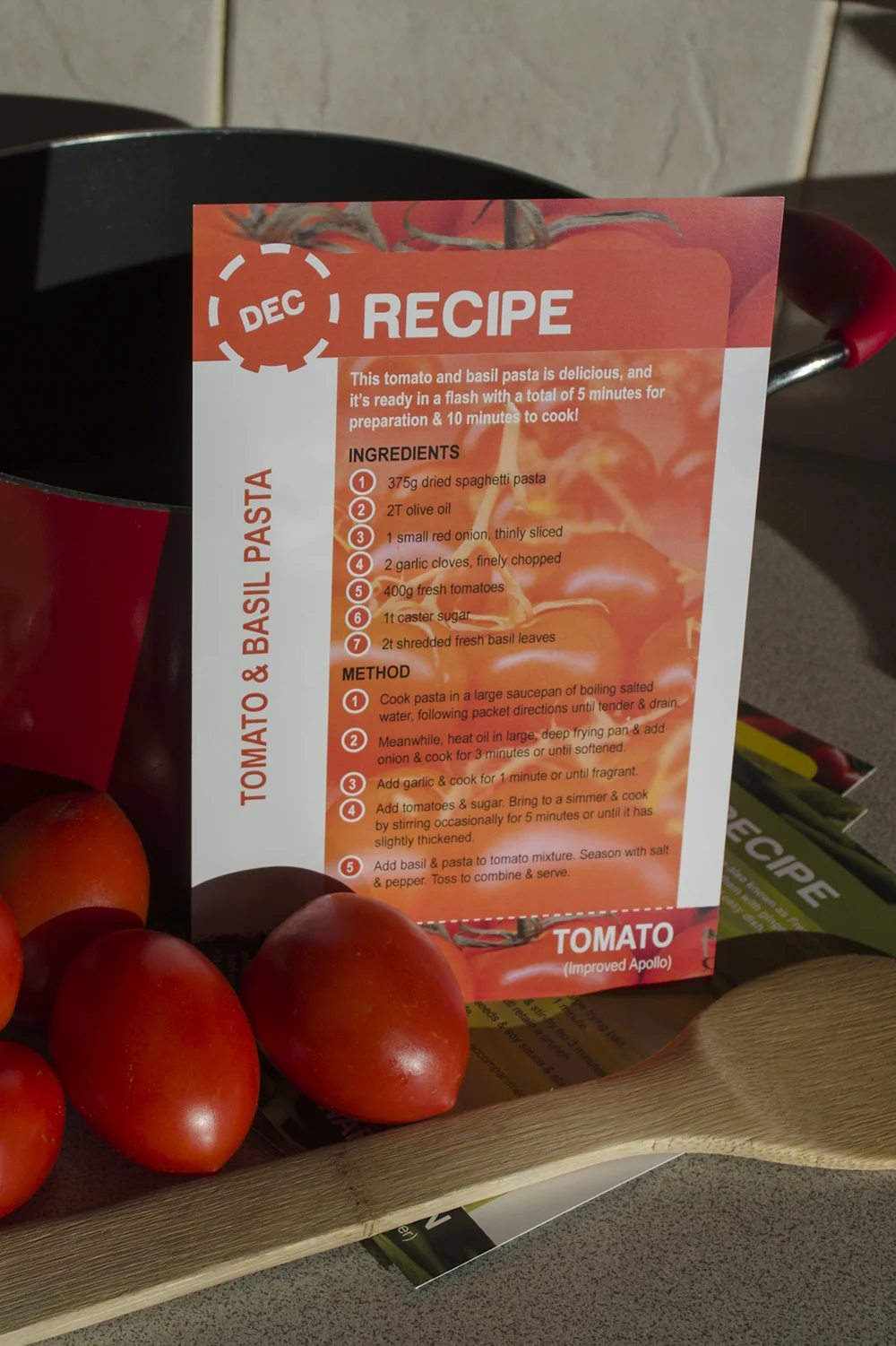
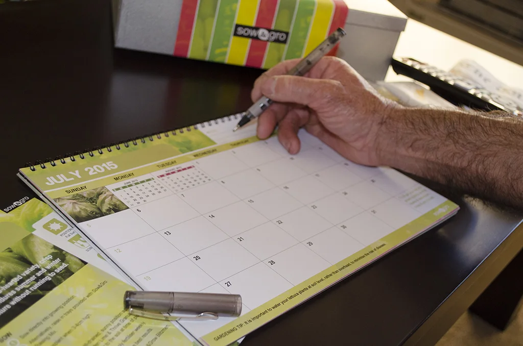
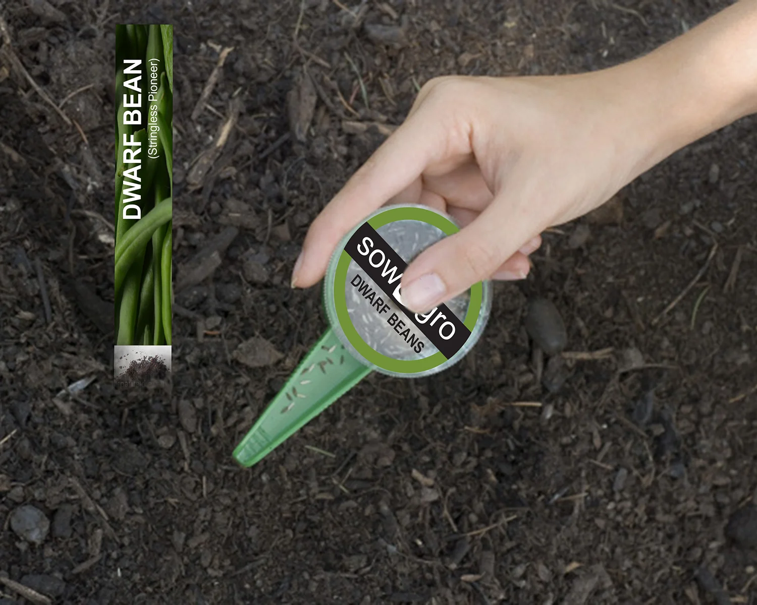
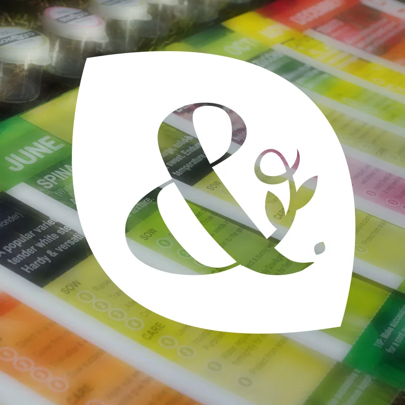
Constructing the calendar around a gardening concept challenges the standard notion of a calendar, by exploring interactive options through production of a packaging design that is suitable as a gift for the targeted senior audience.
Not only does the packaging design house an A4 calendar, but also a monthly seed kit including gardening cards with bonus recipes for each month and monthly seedling containers. The overall design concept encourages audience interaction, communicating a point of difference to the current market offerings.
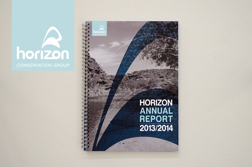
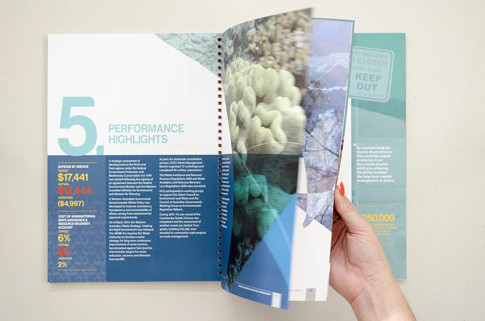
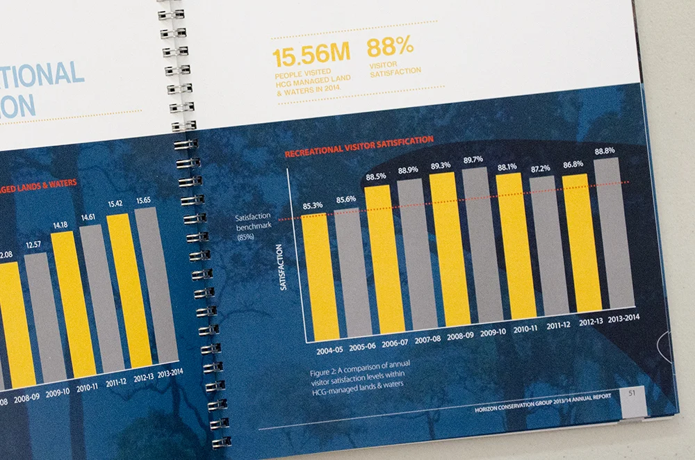
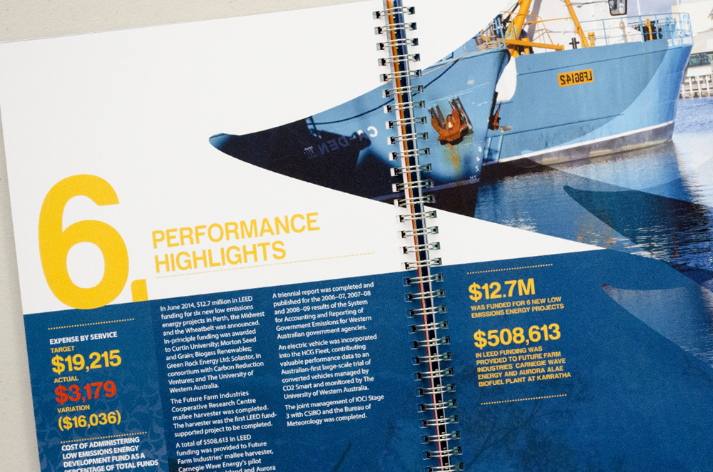
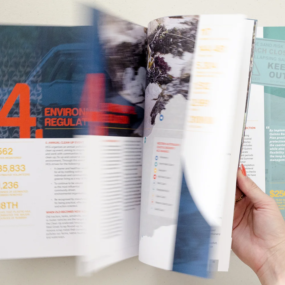
Overview:
The Horizon Conservation Group has the lead responsibility for protecting and conserving the state’s environment on behalf of the people of Western Australia and is, at its heart, largely an operational agency.
Solution:
This publication has been successfully designed with copy and data that has been appropriately formatted, communicating a clean, fresh and legible design. Brand patterning is generated by the symbol that resonates with the organic, beachy, nature, conveying an environmentally friendly tone of voice that is reminiscent of the brands values. The corporate publication effectively targets environmental stakeholders and prospective environmentally friendly investors.
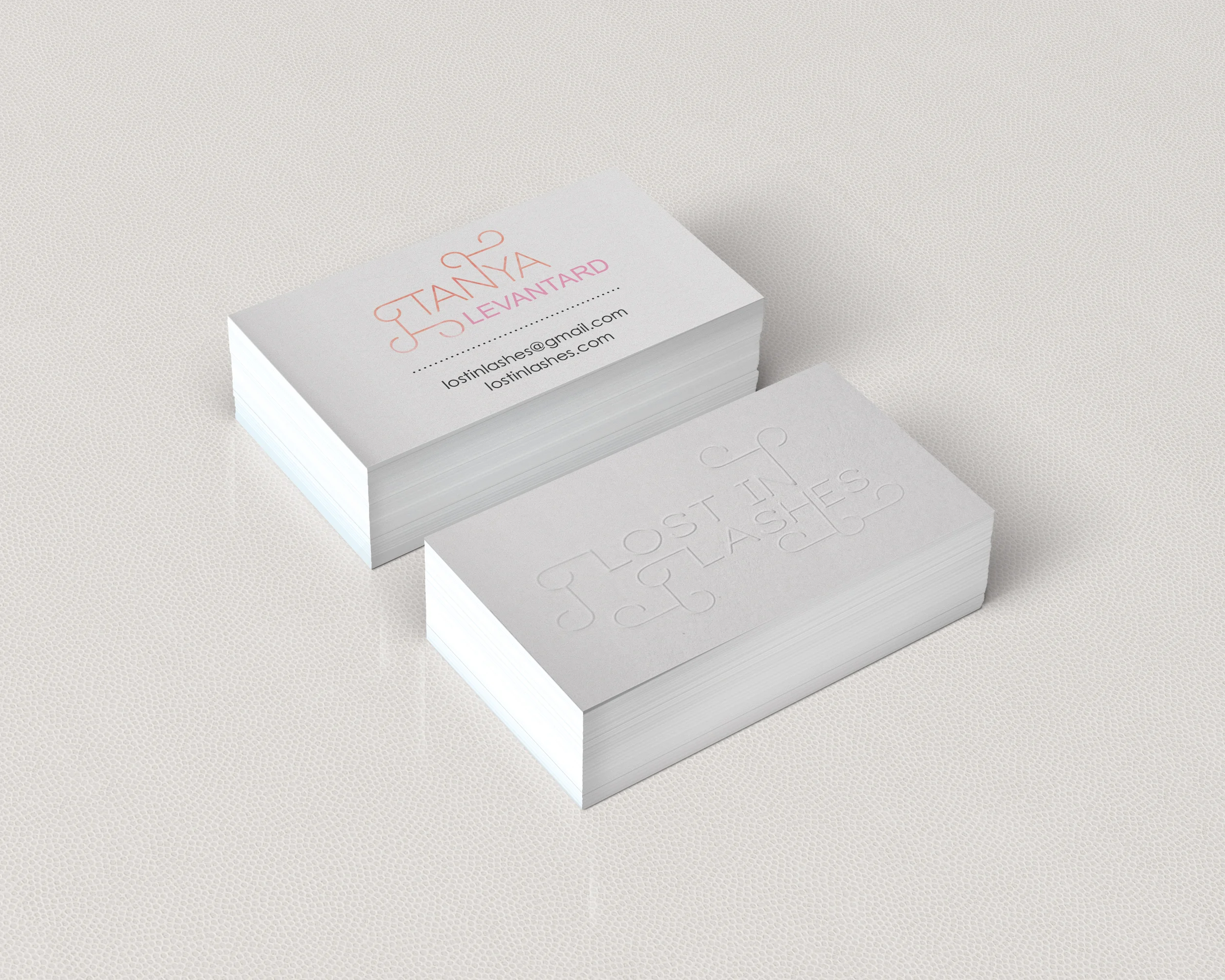
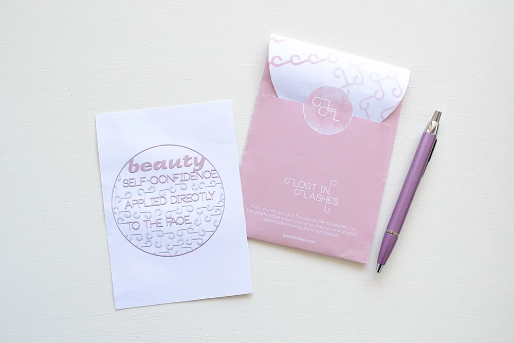
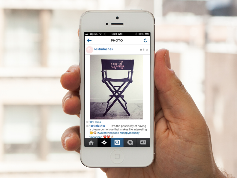
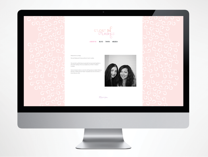
Overview:
Lost in Lashes is a beauty blog by Melissa Plaiche & Tanya Levantard who share their obsession for makeup. The blog provides product reviews, picture & video tutorials and tips and tricks for the everyday woman aged between 18 - 40. The company also has an Instagram and Facebook account to promote their blog, along with freelancing as makeup artists.
Problem:
Lost in Lashes has a current brand although is quite ameture and getting lost amongst the vast competition. The company is requiring a brand revitalisation to be more professional, refresh their tired brand and align with brand values & personality.
Solution:
The basis of the new identity was constructed around a maze concept with the graphic patterning of lashes arranged in clusters that position the audience to find the logotype. The typographical execution is influenced by Mariam Bantjes with the graphic patterning intertwining with letter-forms that carries across to promotional material to create a consistent and unified brand image. Overall the brand strategy embodies a fresh, fun, bubbly, clean and feminine tone of voice and brand personality that effectively appeals to the feminine target audience.